Identity Conference logo: four directions
Draft for the Identity team, November 21, 2026. Four proposals for a lasting Identity logo (the one that stays every year), made to sit beside Sasha's Unashamed art, not replace it. Direction A is the one on the draft website. Nothing here is approved; the choice belongs to the team and leadership. Colors are based on the ones the design team sent: mocha, burnt orange, sky blue, pale yellow. This is an offer, not part of the website work: use any, none, or ideas from them.
How to compare: look at the small sizes first. A logo that still reads at browser-tab size will work everywhere else.
AThrough-line
Closest relative of Sasha's banner. Heavy capitals, and the stem of the T is carried up and down the way her orange bar runs through UNASHAMED, so the T becomes a cross. The yearly theme sits to the right of the bar.
Wide version on the four backgrounds
With the yearly theme in its slot
Square icon, from large down to browser-tab size, and as a round profile picture
120px64px32px16px
profile
120px64px32px16px
profile
In use: website header above Sasha's banner, and a livestream corner mark
SCHEDULE SPEAKERS REGISTER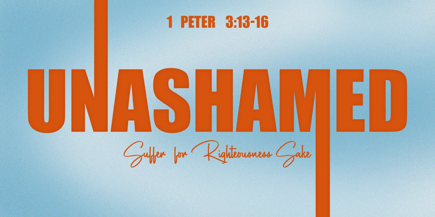
Livestream frame (placeholder)
Strong: looks like it belongs with the 2027 art, very bold. Watch: the icon is a plain ID with a tall bar; the cross only shows in the wide version.
BCrest
A shield with ID cut out of it and a small cross at the point. Feels like a team or school emblem.
Wide version on the four backgrounds
Square icon, from large down to browser-tab size, and as a round profile picture
120px64px32px16px
profile
120px64px32px16px
profile
In use: website header above Sasha's banner, and a livestream corner mark
SCHEDULE SPEAKERS REGISTER
Livestream frame (placeholder)
Strong: one solid shape, the easiest to print on shirts, stickers and badges. Fits this year's knights idea but does not depend on it. Watch: shields are common; the wide type is calmer than the banner.
CKnown
Soft lowercase drawn with one rounded line. The d carries a small cross and both t's are crosses. Friendly instead of loud.
Wide version on the four backgrounds
Square icon, from large down to browser-tab size, and as a round profile picture
120px64px32px16px
profile
120px64px32px16px
profile
In use: website header above Sasha's banner, and a livestream corner mark
SCHEDULE SPEAKERS REGISTER
Livestream frame (placeholder)
Strong: warm, personal, works well in a round profile picture. Watch: the quietest of the four next to Sasha's heavy type; thin lines need care when stitched small.
DLabel
A tag with two cells. The left cell (ID) never changes; the right cell changes every year: 2027, UNASHAMED, a session name. Built as a system, not just a picture.
Wide version on the four backgrounds
With the yearly theme in its slot
Square icon, from large down to browser-tab size, and as a round profile picture
120px64px32px16px
profile
120px64px32px16px
profile
In use: website header above Sasha's banner, and a livestream corner mark
SCHEDULE SPEAKERS REGISTER
Livestream frame (placeholder)
Strong: solves the lasting-brand-plus-yearly-theme question by design; great as a livestream corner bug and on merch tags. Watch: no cross in it; the most 'streetwear' of the four.
About the lettering
The logos are vector shapes, not live fonts, so nothing needs installing. The large letters were drawn as shapes. The small text was outlined from Archivo, a free open-license font (SIL Open Font License), which allows commercial, print and web use.